Hollie's Animation Station
Monday, 4 June 2012
Wednesday, 30 May 2012
Update of rendered frames...
Here is the first half of the renders put together with the correct music track We are waiting for the rest of the renders to put them into Premiere, along with the credits. Again, I think we're unhappy because of the lack of time for post production. If we weren't waiting for renders we wanted to 'pretty' it up - with grass, hilly backgrounds and adjustments to lighting in after effects.
Opening credits...
We can't actually decide on a name for our piece, as it is not a story. However, we decided to 'fancy' up our names just so it didn't start off as a boring black and white piece of text... So, here it is. - Here I used photoshop. I think the plan is to simply fade in and out to black with this because we need the film to start on black (horse's pupil).
Tuesday, 29 May 2012
Tuesday, 22 May 2012
Monday, 14 May 2012
Hand in...
Really not happy with the work we handed in. Because of rendering problems with my laptop and the studio computers, each frame was taking 50 minutes to render!!! Not happy. So, yes, the worst came to worst and we decided we just had to hand in a playblast of our camera movement. Again, we had problems! surprise surprise. So here's the very crude playblast. You will notice that the length has changed dramatically. After speaking to Denise, she said that the camera movement needs to be much slower for both showing the modelling skills and in order for the audience to not feel sick!
Friday, 4 May 2012
lighting with the sky
So, forgetting the pointy moon... I wanted to check a render of the teacups, with the spot lights I have added. I think the contrast works well, obviously there is a grey shadow/reflection on the teapot and cups, but I think that this can be remedied by applying grass to the ground.
Just an alternative shot, with the extra lighting on the carousel. the glow on the lights works well. It wasn't planned but I think it gives a mysterious, misty feel.
I have adjusted the spot light which is angled onto the dome, here it doesn't look bad!
Monday, 30 April 2012
happier...
Just a quick render of the teacups (without shadows) to check the brightness of the spotlights above. I am happy with how well the pick up the elements in the ride. Obviously the lightbulbs don't have their own seperate lights inside, they only have a glow that has been applied. So the next step is to add subtle lights, especially around the back of the roots to make it seem as if they are emitting their own light, which would result in areas of the roots to be brighter than others.
Again, a render of the carousel creatures as of yet. Here I have lowered the intensity of the point lights within the carousel, which resemble lights on a carousel more than before. I think with the light from the moon which is to be added and some secret 'filler' lights which will pick up the underside of the creatures, and help to make the scene look more realistic.
adding a sky into the scene
We are using a painted sky because we did not want the lights which we are setting up in our scene to be affected by additional light coming from the sky (which is what would happen when using a hdri image). So, by painting this image and applying it as a texture to a dome, this way the sky will not emmit it'sa own light and a simple point light can be used and positioned in front of the moon in order for it to appear to have it's own light source.
Here I just wanted to show that the image is attatched onto a band of faces arounf the dome. The image does not stretch or distort to the top. When the lighting is set properly, there is no abvious seam where the image stops and the matte black faces begin. This is why the sky gradually becomes darker towards the top.
Sunday, 29 April 2012
playblast of the first shots
It is very difficult to work out an appropriate speed for the camera. There is a fine line between the audience becoming bored, and being given enough time to look at the detail on the models. I am fairly happy with the speed of the camera up to the point of the snake's head. However, I may go back and slow down the camera movement from there to the point where it reaches the organ. (the box). I feel it may be too fast. I will be able to fix this when the rest of the models are in place.
playing with lighting... and failing it seems
Ok, so here is a quick pic of my models altogether. The centre of the carousel may seem 'blocky' because it hasn't been smoothed before rendering. I have inserted five point lights and placed them high above the modelled lights which have a glow applied to them. The aim was to see whether I could make the light source look as if it was coming from the physical lights on the carousel. I like the way in which the top section of the carousel middle is lit. However, it is obvious that the point lights are in the scene. They are clearly reflecting off of the blinn texture on the carousel. So, I shall have another play to see if there is a way of meeting in the middle.
Just a quick check to see how a close up of the creatures would look with the same lighting. Here, I have included Vicky's model of the horse, it gives me a good idea of where to go in terms of lighting because these will be the beginning shots.
Thursday, 26 April 2012
more mishaps...
Nothing to be proud of, but I wanted to post these just to show what I have been playing about at all day. I'm sure that some settings need to be changed, as I seem to not be able to change the colour balance on the displacements in this scene. Especially on the exterior poles of the carousel, and the roots of the teacups. Perhaps it's something to do with importing seperate scenes into another? I shall have to investigate. But it's a rather annoying problem. On the other hand, this gives a rough idea of the layout of the assets so far.
Here I have applied a very basic glow to each of the bulbs. Personally I think they're too yellow. So I will have to change that to an off white or paler tellow. I want it to look eirie and not warm. Again, spot lights will help with this. I also think that the red cup is a tad too bright; it looks more of a toy than a used seat. But... the displacement maps for this ride are coming along!
Wednesday, 25 April 2012
Cloth on the statue
some like to work... some just plain don't want to co-operate
As you can see, the displacements are causing a few problems. Depending on which displacements are applied to cartain elementsd within the scene, and their settings, other models are affected. I need to look into this as it seems that multiple models are sharing displacements? Simon suggested re-exporting all of the models individually and re-applying each texture and displacement. Which does mean starting again, but if it works then... hey ho!
Tuesday, 24 April 2012
faffing about
It's pretty clear what I have been playing about at all day... I just thought i'd post these few pictures to show the 'annoyingness' of maya! I madfe sure that I have written down each setting for the alpha gain and alpha offset of each asset's displacement map, so that when it was time to bring them all into one scene I would be able to apply them quickly and CORRECTLY!! But, just to keep me on my toes, maya had other ideas. I have imported all of the cups individually and applied the textures and displacements, however all of the settings appear to be too high for the models in this scene. So a lot of adjusting has had to be done, I'm finding that a lot of the settings have had to be made into single figures. I am getting there... slowly.
Monday, 23 April 2012
confuzzled by the stalls
not entirely sure why this keeps happening to the hotdog stall... personally I think it looks quite funky. But nevertheless it's not what we're going for.
whoopsy-daisy... i forgot to smooth the mesh (add divisions) before I applied the displacement and render. So all fixed!
Above is the basic mesh on smooth.
Thursday, 19 April 2012
displacement on the snake...ish
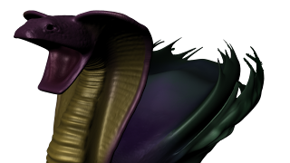

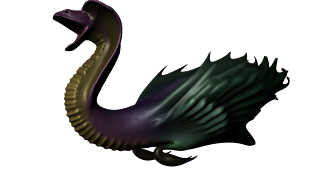
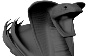
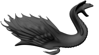
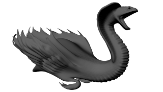
The displacement here is worse than that on the pig. The front part I am perfectly happy with, it seems to work well. But the back end, especially on the tips of the outer feathers, the displacement has become 'stepped'. It's looking very ugly at the moment. Also the texture is not fully donw, they are simply block colours for the time being.
Monday, 16 April 2012
Tuesday, 10 April 2012
Subscribe to:
Comments (Atom)


